2023-24 National Postsecondary Student Aid Study (NPSAS:24) Full-Scale Study - Institution Contacting and List Collection
2023-24 National Postsecondary Student Aid Study (NPSAS:24) Full-Scale Study - Student Data Collection and Student Records
Appendix E NPSAS24 FS Student Institution Staff Usability
2023-24 National Postsecondary Student Aid Study (NPSAS:24) Full-Scale Study - Institution Contacting and List Collection
OMB: 1850-0666
2023–24
NATIONAL POSTSECONDARY STUDENT AID STUDY (NPSAS:24)
FULL-SCALE STUDY
Student Data Collection and Student Records
Appendix E
Institution Staff Usability Testing
OMB # 1850-0666 v. 36
Submitted by
National Center for Education Statistics
U.S. Department of Education
September 2023
Contents
Qualitative Testing Summary E-3
Topic 1: Home Page & Task Menu E-7
Topic 3: Student Enrollment List E-13
Topic 4: Resources & Help Menu E-17
Topic 5: Closing Comments E-19
Figures
Figure 1. Institution level and control of participants E-5
Figure 2. Institution department of participants E-5
Figure 5. Registration Overview Page E-9
Figure 6. “Reporting Term Structure” instructions part 1 E-11
Figure 7. “Reporting Term Structure” instructions part 2 E-11
Figure 8. Student Enrollment List mode preference E-14
Figure 9. Excel template help text E-15
Figure 10. Screenshot of Exclusion Counts section on the PDP Enrollment List upload page E-17
Figure 11. Screenshot of PDP Enrollment List upload page E-17
Figure 12. Participants’ preferred method of communication with Help Desk E-18
Figure 13. Participants’ approach to managing PDP user access E-19
Figure 14. Overall ease of completing NPSAS:24 Field Test E-20
This appendix summarizes the results of qualitative testing conducted concurrently with the 2023-24 National Postsecondary Student Aid Study (NPSAS:24) Field Test to prepare for the upcoming full-scale institution data collection. This testing included virtual usability testing sessions with institution staff. Full details of the pretesting components were described and approved in NPSAS:24 generic clearance package (OMB# 1850-0803 v. 330). A summary of key findings is described first, followed by a detailed description of the study design, and finally a discussion of detailed findings from the focus group sessions.
Qualitative Testing Summary
The National Postsecondary Student Aid Study (NPSAS:24), conducted by the National Center for Education Statistics (NCES), collects student data directly from postsecondary institutions. In order to improve the quality of the data collected as well as reduce the burden of completing the data request for institution staff, RTI International, on behalf of the National Center for Education Statistics (NCES), part of the U.S. Department of Education, contracted with EurekaFacts to conduct virtual usability testing sessions with institution staff who are responsible for completing the NPSAS institution data request via the Postsecondary Data Portal (PDP).
In general, the usability testing sessions addressed the following topics:
challenges in retrieving and providing required data; and
functionality and usability of the data collection tool.
For this round of testing, participants evaluated and/or completed tasks on the Postsecondary Data Portal (PDP), specifically focusing on the home page, task menu, registration page, student enrollment list, and resources and help menu.
Participant Sample
Participants for usability testing were drawn from a list of institutions that submitted student enrollment lists for the most recent round of NPSAS data collection, NPSAS:24 Field Test. The list included staff from a variety of institution sizes and institution sectors. Twelve individuals participated in a usability testing session (see the section on Study Design for more information).
Key Findings
Overall, participants reported a mix of experiences completing the NPSAS:24 Field Test data collection process. In many areas, such as determining who to include on enrollment list, participants found the process easy to understand and complete; however, participants did note some areas of confusion or recommendations for improvement. A few key themes emerged across the twelve usability sessions.
Home Page & Task Menu. This section focuses on questions related to participants’ experience logging into the Postsecondary Data Portal (PDP) website and navigating the Task Menu. Items highlighted were participants' process for logging into the site, if they experienced any difficulties accessing the PDP website. if it was easy or difficult for participants to determine tasks needed to be completed on the page, and if they found any language or parts of the page confusing. Overall, participants did not have any major issues logging into the site and felt the process was straightforward and self-explanatory. Also, participants found it easy to complete desired tasks on the Task Menu with no confusion.
Registration. This section pertains to the accounts of participants while they were in the process of filling out the 'Register your Institution' section on the PDP website. The participants were asked to provide details about their institution’s term structures and the process of providing this information during the registration process. All participants were able to complete the registration process without any difficulties and found it easy to follow.
Student Enrollment List. In this section, participants were asked to review the Student Enrollment List and provide feedback on their understanding of the file specifications. Additionally, they were asked to share any challenges they encountered while entering the required data and provide feedback on the enrollment list Excel template option. Overall, the instructions were found to be helpful and easy to understand by the participants.
Resources and Help Menu. In this section participants discussed resources and help menu items related to the PDP website, specifically how useful and/or helpful areas were related to FAQs, task instructions, help desk method of communication, and management of user’s website access. Overall, participants found the resources and help menu to be useful and provided helpful recommendations on other areas to highlight that would be helpful to others visiting the PDP website.
Study Design
Recruitment and Screening
Recruitment Procedures. RTI conducted the outreach and recruitment of institution staff from an existing list of institutions that had provided the student enrollment list for the NPSAS:24 Field Test. In addition to being on the list, participants had to be a current employee at the institution that participated in the NPSAS:24 Field Test and responsible for providing the student enrollment list.
All recruitment materials, including but not limited to initial outreach communications, Frequently Asked Questions, reminder and confirmation emails, and informed consent forms, underwent OMB approval. All participants who wished to receive an incentive were sent a $60 e-gift card virtually as a token of appreciation for their efforts; not all participants accepted an incentive.
To ensure maximum “show rates,” participants received a confirmation email that included the date, time, a copy of the consent form, and directions for participating in the virtual session. All participants received a follow-up email confirmation and a reminder telephone call at least 24 hours prior to their session to confirm participation and respond to any questions.
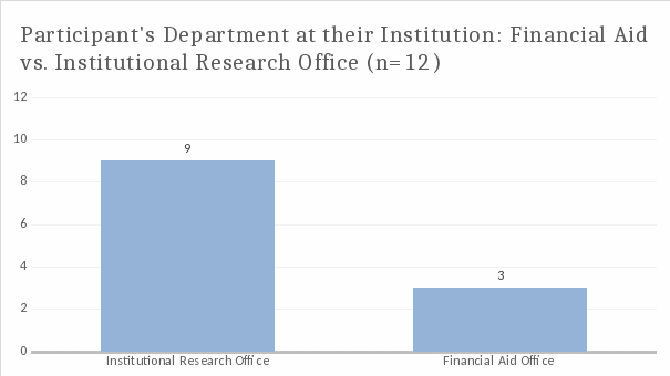
Recruitment Results. A total of 12 institution staff participated in the usability testing. Figure 1 summarizes the institution level and control of the participants and figure 2 summarizes the institution department in which the participants worked.
Figure 1. Institution level and control of participants
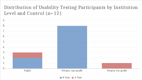
Figure 2. Institution department of participants
Data Collection Procedure
EurekaFacts conducted virtual usability interviews using Zoom, between February 15 and April 18, 2023. The interview sessions lasted no longer than 90 minutes.
Session Logistics. Prior to each interview, an EurekaFacts employee created a Zoom meeting invite with a unique URL. When participants first entered the interview session, interviewers introduced themselves to the participant and followed the OMB approved script and interview protocol. At the end of the session, participants were thanked and informed on when to expect the virtual $60 e-gift card. The recording of the session was then terminated, and the Zoom meeting ended to prevent further access to the virtual room.
Consent Procedures. Data collection followed standardized policies and procedures to protect participants’ privacy, security, and confidentiality. Digital consent was obtained via MS forms prior to the interview for most participants. Participants that did not return a consent form prior to their scheduled interview were able to complete the online consent form before beginning the interview. The consent forms, which include the participants’ names, were stored separately from their interview data, and are secured for the duration of the study. The consent forms will be destroyed three months after the final report is released.
Prior to starting the survey task, interviewers asked for permission to audio and video record the interview. Once permission was granted, all participants were video and audio recorded via the virtual platform, Zoom. Participants were then reminded they were providing feedback on the NPSAS:24 Field Test and Postsecondary Data Portal website and reassured that their participation was voluntary and that their answers may be used only for research purposes and may not be disclosed, or used, in identifiable form for any other purpose except as required by law. Participants were also informed again that the session would be recorded.
Usability Testing Content. The goal of the discussion was to gain insight about institutional staff experiences participating in prior data collections; identify problematic processes, specifications, questions, terms, and/or resources; better understand how data are organized at the institutions; and identify any challenges for future data collections.
Institution staff were asked to discuss their experience with providing the student enrollment list for the NPSAS:24 Field Test on the Postsecondary Data Portal (PDP) website, focusing on success of determining which students to include or exclude from the list, formatting or coding to meet file specifications, and data checks. Tasks included assessing the home page, task menu, completing the registration page, formatting and uploading the student enrollment list, and reviewing the helpfulness of the available resources and help menu.
The following topics were discussed in the sessions:
Topic 1: Home Page and Task Menu
Topic 2: Registration
Topic 3: Student Enrollment List
Topic 4: Resources and Help Menu
Topic 5: Closing Comments
Coding and Analysis
The cognitive interview sessions were audio and video recorded using the Zoom meeting record meeting function. After each session, a coder utilized standardized data-cleaning guidelines to review the recording and produce a datafile containing a high-quality transcription of each participant’s commentary and behaviors. Completely anonymized, transcriptions and observations tracked each participant’s contributions from the beginning of the session to its close. As the first step in data analysis, coders’ documentation of the interview sessions into the datafile included only records of verbal reports and behaviors, without any interpretation.
Following the completion of the datafile, two reviewers assessed it. One reviewer cleaned the datafile by reviewing the audio/video recording to ensure all relevant contributions were captured. In cases where differences emerged, the reviewer and coder discussed the participants’ narratives and their interpretations thereof, after which any discrepancies were resolved. The second reviewer conducted a spot check of the datafile to ensure quality and final validation of the data captured.
Once all the data was cleaned and reviewed, research analysts began the formal process of data analysis which involved identifying major themes, trends, and patterns in the data and taking note of key participant behaviors. Specifically, analysts were tasked with classifying patterns within the participants’ ideas in addition to documenting how participants justified and explained their actions, beliefs, and impressions. Analysts considered both the individual responses and their ability to complete the tasks asked of them.
Each topic area was analyzed using the following steps:
Getting to know the data – Several analysts read the datafile and viewed the video recordings to become extremely familiar with the data. Analysts recorded impressions, considered the usefulness of the presented data, and evaluated any potential biases of the interviewers.
Focusing on the analysis – The analysts reviewed the purpose of the interview and research questions, documented key information needs, and focused the analysis by question or topic.
Categorizing information – The analysts gave meaning to participants’ words and phrases by identifying themes, trends, or patterns.
Developing codes – The analysts developed codes based on the emerging themes to organize the data. Differences and similarities between emerging codes were discussed and addressed in efforts to clarify and confirm the research findings.
Identifying patterns and connections within and between categories – Multiple analysts coded and analyzed the data. They summarized each category, identified similarities and differences, and combined related categories into larger ideas/concepts. Additionally, analysts assessed each theme’s importance based on its severity and frequency of recurrence.
Interpreting the data – The analysts used the themes and connections to explain findings and answer the research questions. Credibility was established through analyst triangulation, as multiple analysts cooperated to identify themes and to address differences in interpretation.
Limitations
The report's key findings were based solely on institution staff interview analysis. All participants saw the Postsecondary Data Portal (PDP), however depending on how participants navigated the site, fewer participants saw some items or sections. There are also timing constraints due to the nature of the interview process which interrupts the flow of the survey while participants are answering specific follow-up probes about items and sub-items. Additionally, even when all items were administered in an interview, every participant may not have responded to every probe due to time constraints, thus limiting the total number of respondents providing feedback by item and by probe.
Still, the value of qualitative usability interviews is demonstrated in their ability to provide unfiltered comments and provide observation of the general functionality of a tool’s features and resources from a segment of the target population, the real users. Rather than functioning to obtain quantitatively precise measures, qualitative research is advantageous in developing actionable insight into human-subjects research topics. This provides an accurate scenario of the ease-of-use of the survey instrument, provides insight into the user’s perception of the experience, as well as identifies the areas where staff consistently encounter issues compiling and submitting the NPSAS data request.
Findings
This section presents detailed findings from the usability testing sessions with institution staff.
Topic 1: Home Page and Task Menu
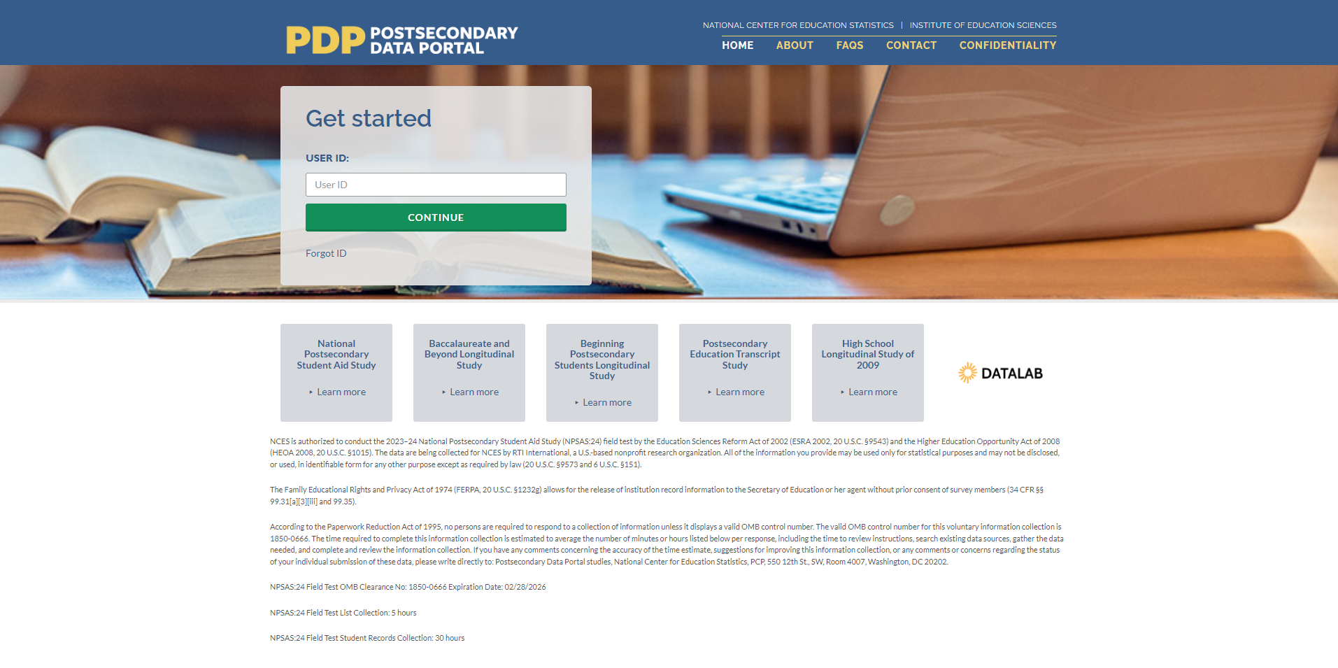
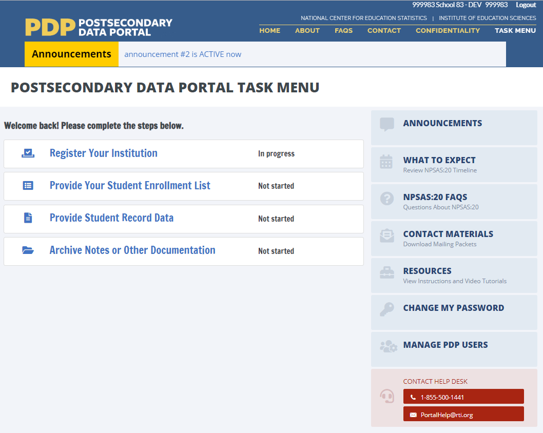
This section focuses on questions related to participant’s experience logging into the Postsecondary Data Portal (PDP) website from the Home Page (figure 3) and using the Task Menu (figure 4).
Ease of accessing the PDP website
Participants were asked if they experienced any difficulties while accessing the PDP website and to explain the steps they took for logging in. A majority (10 out of 12) participants indicated that they experienced no issues while accessing the PDP website. Participants recognized some areas for improvement such as easier to remember usernames and passwords and for the PDP website to have a longer screen time duration prior to automatic logout of inactive users.
Using the Task Menu
Participants were asked to report their first impression of the page, if it was easy or difficult for participants to determine tasks needed to be completed on the page, and if they found any language or parts of the page confusing. All participants felt that it was easy to determine what task(s) needed to be completed.
Summary/Recommendations
“The user generated ID, I think that
I was assigned, it was one I could never remember. I had to, which
is I typically don't, do the process of writing down a username.”
Topic 2: Registration
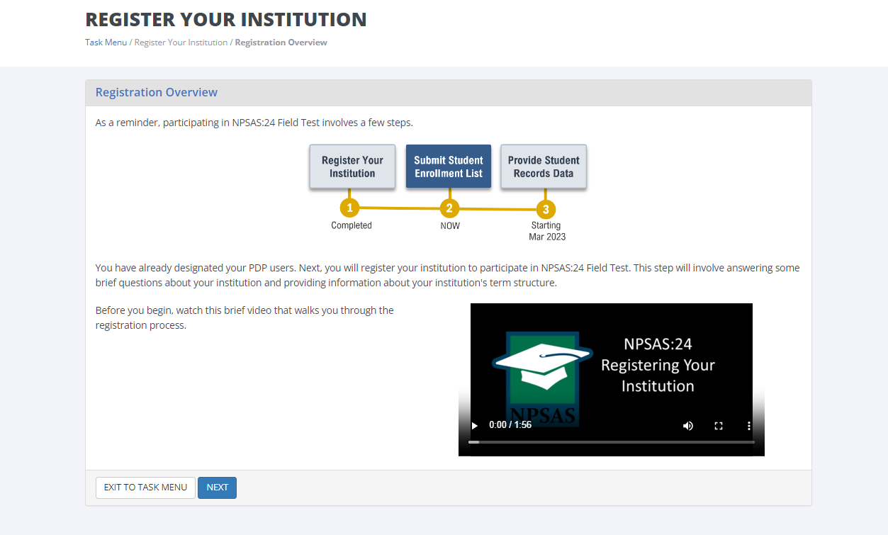
This section focused on participant experiences completing the ‘Register Your Institution’ portion of the PDP website (figure 5). Participants were asked to provide information about their institution’s term structure and academic calendar. All twelve participants were presented with this task.
Figure 5. Registration Overview Page
Registration Process
All 12 participants confirmed that they were the person who completed the registration page. Five participants noted they needed input from other offices at their institution to complete the registration page. Of these, four contacted their registrar’s office and one contacted the financial aid office.
Registration Pages
Before beginning the walk through of the registration process, participants were invited to make any opening comments about the ‘Registration Overview’ page (figure 5). Five participants mentioned the instructional video on the page. Two participants expressed interest in the video as it may be helpful in case there was any confusion while completing this step. Three participants said that the video did not interest them because they had either completed the registration process before or did not have the time to watch a two-minute video.
“It's great that there is an add user
feature.”
One participant described that although they did not need to add any users, they would be annoyed by the redundancy of adding users every year they completed the NPSAS:24 Field Test. However, this participant described that adding a user is easy.
Institution Name page. None of the participants expressed difficulty and all participants acknowledged that the university name displayed was correct.
“Universities
have three start time--fall, spring, and summer--and this is not
really recognizing that a lot of institutions have just year-round
continuous terms that overlap and start differently. So, if your
institution has distinct
terms with explicit start dates, you should enter information by
terms. So, this is also a little tricky for us.”
Three participants enjoyed how visually appealing the ‘Reporting Term Structure’ page is and the instructions on whether to report by term or month. One participant specifically stated their appreciation of the visuals the page had, “So, I kind of like the look and feel of the pictures here. And I think it’s very clear when I read the difference between these [reporting by month vs. reporting by term], to me, it feels very clear.”
“So, I kind of like the look and feel
of the pictures here. And I think it's very clear when I read the
difference between these [reporting by month vs. reporting by term],
to me, it feels very clear.”
Figure 6. “Reporting Term Structure” instructions part 1
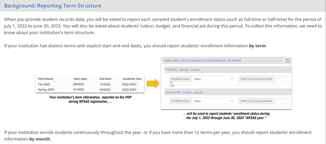
Figure 7. “Reporting Term Structure” instructions part 2
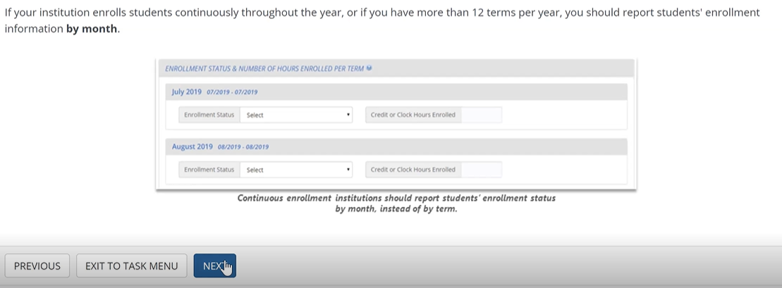
When prompted to indicate how to report the students' enrollment status on the 'How to Report Enrollment Status' page, either by term or month, all twelve participants were able to easily select their preferred option. Two participants were pleased with how clear the page appeared. Due to one participant's institution having several terms, they selected 'Report Enrollment Status by Month' as it eliminated the need to enter individual term dates.
Participants were prompted to enter terms and term dates. Two participants were confused by the use of the word “date” on the page as it only required them to input month and year, whereas the participants expected the format to include the day as well, such that “date” should mean month-day-year to them. In addition, two other participants reported their confusion with overlapping term reporting, noting that this issue repeats annually. Out of all twelve participants, one encountered an error message when attempting to submit their term dates due to providing a term that did not fall within the target date range.
“So yep, I can do March 17th, but
it's not going to include every student who's enrolled through April
30th. So just heads up. And I think every year I click no, because I
don't understand the question based on our enrollment dates.”
Endorse Name on Contact Materials Page. Participants were asked if their name and title in the contact materials could be sent to students sampled from their institution. All participants (n=12) had no difficulty selecting their preferred response. Nine participants selected 'Yes’ and the remaining three selected 'No’. One participant said that they lacked confidence in their abilities to provide advice to students. Two other participants that selected ’No’ explained that the students would not know who they are.
“We are a clock hour institution, but
we also issue credits. I don't exactly know, and we have two
programs, the teacher certification. I wouldn't know how to answer
this question, the credit or should I do the credit [sic: clock]?”
Student System Information page. All 12 participants selected their Student System Information program and hit the ‘Next’ button without any difficulties or confusion.
Closing pages. At the end of the registration process participants were asked to indicate any major obstacles that impacted their institution’s participation in NPSAS:24 Field Test. Eight participants did not have any obstacles during the process. Three of the remaining participants were undergoing a software transition, while another participant was facing challenges due to understaffing at their institution. All the participants had saved and finalized their registration with no difficulty or confusion.
Summary/Recommendations
“The information as far as being able
to understand it, it was extremely easy to understand, but I just
wanted to get some of the nuances to make sure I was reporting
correctly.”
Three participants noted that they had some difficulty locating the necessary information for certain pages. Once they had the information, though, they were able to answer the questions without much trouble. One participant described the registration process as seamless, but noted that it was time-consuming, “It was easy. I mean, I know on the screen, maybe it took probably a little than it was by myself, but yeah, very seamless process.”
Participants provided several recommendations for the registration process.
One suggestion was to acknowledge that summer terms may fall outside the dates provided and include a prompt for institutions to specify if their terms are optional.
Another recommendation was to consider the unique nature of institutions and their academic structures, such as certificate programs and continuous enrollment periods.
Participants also suggested including a prompt for institutions to provide additional information if their academic structure differed from the standard options provided.
One participant suggested adding a summary page before submission to quickly review all answers, as it would be helpful and save time compared to double-checking every screen.
Overall, the participants' feedback provided valuable insights for improving the registration process to better accommodate the varying needs of different institutions.
Topic 3: Student Enrollment List
Participants were tasked with reviewing the Enrollment List pages on the PDP, discussing their experienced providing data for the NPSAS:24 Field Test, and uploading a sample enrollment list file to the website. All twelve participants completed this task.
Excel Template Option
In the NPSAS:24 Field Test, institutions were offered two options for submitting the student enrollment list. The first option was a pre-formatted Excel template, which was newly introduced for the NPSAS:24 Field Test. The second option was to create their own files following a specifications document, which is consistent with prior rounds of NPSAS.
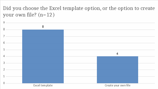
Excel Template or Creating Own File. Out of the twelve participants, eight chose the pre-formatted Excel template and the remaining four chose to create their own file. Figure 8 shows participant preference for file creation. When participants were asked if they would choose the same option if they were to complete this task again, all participants answered yes.
Figure 8. Student Enrollment List mode preference
Participants chose to use the Excel template provided to them rather than creating their own enrollment list for several reasons. One participant was concerned about mistyping a field name and having the data rejected if they did not use the template. Four participants appreciated the organization and clear headers provided by the template, which made it easier for them to enter data in the correct format. Another participant valued the template because it ensured that they did not accidentally eliminate a required column from the report. Additionally, one participant preferred to have a record of the exact request each year, so they could retain the exact template provided to them.
One participant preferred to simplify their enrollment list creation process by creating their own file with only the required fields and ensuring it was in the correct format for uploading. They found this easier than using the existing Excel file with unpopulated fields. Another participant also cited reasons like being shorthanded on IT staff, preferring to do the formatting while creating the file, and needing to compile information from various sources.
Help Text. Of the twelve participants, half (n=6) reported the help text as a beneficial resource. One participant commented on the effectiveness of the red text in drawing attention to key information. However, another participant encountered difficulty reading the full text, as it was partly obscured by a red triangle (figure 9). Two participants reported not noticing the help text. Overall, participants expressed appreciation for the clarity and conciseness of the help text.
Figure 9. Excel template help text
Enrollment List Instructions
“It's easy. It's not difficult. It's
just you got to make sure you read through the whole thing. Don't
just rely on the top.”
“Really it was easy because here you
have a list of what include, what do not include in that here. You
see eligible, not eligible is very clear. I found that super clear.”
“The providing of the list is easy if
all the information that I need or that you require is available to
me, it's easy for me to just copy and paste.”
Preparing the Enrollment List
All twelve participants said it was very easy to locate the field where they needed to enter their enrollment list data, and none of them encountered any difficulty in doing so. Specifically, one participant expressed that entering the data was an easy task due to their specific and clear directions, “It was very straightforward. This follows specifications really made it clear and then just able to enter the data, pretty straightforward.”
“It was very straightforward. This
follows specifications really made it clear and then just able to
enter the data, pretty straightforward.”
Data Formats and Coding Institution Data. Most of the participants (n=8) did not encounter any issues with data formats. Furthermore, eleven participants did not report any difficulties in coding their institution's data to comply with the file specifications. However, some (n=3) participants did state that coding the data was very time consuming.
Some participants reported minor challenges with the data formats. One participant discussed the challenge of obtaining social security numbers for the list, particularly for international students. This participant questioned why the social security numbers were needed, as they are not typically requested. Another participant discussed a problem related to data formatting, specifically regarding the presence of decimal points in CIP codes. They found it frustrating to remove the decimal point because it required a lot of work to get the data to work correctly, and they were concerned that smaller campuses may not have someone with the expertise to handle such issues. Additionally, this same participant had difficulty coding information related to certain degree programs and class levels, which required additional time to sort and find the necessary information.
One participant had to run multiple reports and use VLOOKUP function to combine information from various sources. Another challenge a participant faced was that their systems and classifications changed annually, requiring individuals to rebuild the data from scratch each time they participated in a report. In terms of specific fields, clock hours and credit hours posed a challenge for one participant because program clock hour students could have both types of hours, making it difficult to sort out which field the hours should be reported in. Another challenge was with the high school completion date field, where some individuals only had the month and year entered in the system instead of the day, which made them wonder if the day was necessary for the report. However, half (n=6) of the participants did not encounter any challenges.
Uploading the Enrollment List
Error Messages. Out of the twelve participants, four received error messages when uploading their student enrollment list. Three of these participants understood the error message and quickly fixed the issue by going back to their file. However, one participant found the error message too vague and decided to email the help desk for assistance.
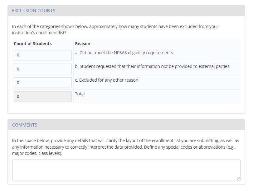
Only two of the participants were confused by the enrollment list page. One participant found the ‘Exclusion Counts’ section confusing because it did not provide enough context for them (figure 10). They did not believe it was relevant to their submission and assumed it was a requirement of the NPSAS.
Figure 10. Screenshot of Exclusion Counts section on the PDP Enrollment List upload page
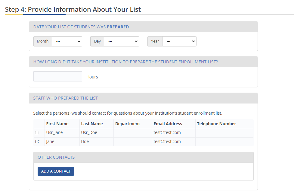
Another questioned the purpose of the three questions in step four of the ‘Provide Information About Your List’ (figure 11). They also expressed frustration about the lack of clarity around the requirements for special codes, major codes, and class levels, as they felt they had spent a lot of time fixing their submission to meet these requirements.
Figure 11. Screenshot of PDP Enrollment List upload page
Summary and Recommendations
“Like I said, the directions are
pretty straightforward, just very time-consuming, and
labor-intensive.”
Two participants suggested that having the required fields as minimal as possible would be helpful and providing explanations in the notes box for data points that might not be readily available would be beneficial. Additionally, participants praised the customer service and the responsiveness of the support team. One participant also mentioned the importance of having enough time to prepare the file and not feeling rushed. Another suggestion made by a participant was to provide additional guidance to graduate institutions on what to do if they do not have access to certain types of data.
Topic 4: Resources and Help Menu
In this section participants discussed the Resources and Help Menu pages on the PDP website, specifically focused on how useful and/or helpful areas were related to FAQs, task instructions, help desk method of communication, and management of user’s access.
Overall, participants who had submitted NPSAS data in previous years reported having a better understanding of the PDP website resources and the help menu and found items to be useful. On the Resources page, participants generally found the FAQs section and instructions documents to be useful.
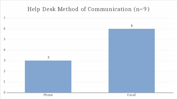
In reference to help desk communication, four participants acknowledged reaching out to the help desk (two via phone and two via email). When asked their preferred method of contacting the help desk, three participants selected “phone,” while six selected “email.” All four of the participants queried about the ease or difficulty of finding help desk information claimed it was easy. Figure 12 shows participants responses to which communication method they are most likely to use.
Figure 12. Participants’ preferred method of communication with Help Desk
Managing PDP Users
When asked how they would manage user access for the PDP, nine participants stated they would utilize the “Manage PDP Users” button, one participant stated they would “ask help desk” while the remaining two participants skipped this question (figure 13). Seven participants who answered the question about task difficulty level found the task easy.
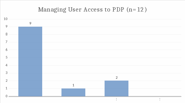 Figure
13. Participants’
approach to managing PDP user access
Summary/Recommendations
Overall participants found the resources and help menu to be useful on the PDP website.
In reviewing recommendations of what information would be most helpful to them on the Resources page, participants requested more information related to the areas of student data, how to complete student enrollment list, background and importance for study, background information on NPSAS, and timeline for what is needed to be the most helpful recommendations.
Topic 5: Closing Comments
Before closing the interview, participants were asked to share additional thoughts to make the PDP website clearer or easier and if there are additional resources or instructions that are missing. They were also asked to rate the ease of completing this task.
The majority of participants (n=9) did not identify any important resources or instructions that were missing and should be included. However, three participants offered suggestions.
One participant recommended adding a suggestion on the webpage that it would be helpful to communicate with the financial aid office at their institution to complete some of the fields for Student Enrollment.
Another participant mentioned the need for instructions to find a student's social security number and suggested that adding instructions to contact the institution's financial aid office would be helpful.
A third participant suggested that the instructions for the Student Enrollment List should emphasize why each column of information is necessary.
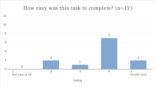
Participants were requested to rate the ease or difficulty of completing NPSAS:24 Field Test Registration and Student Enrollment List data collection on a scale of 1 to 5, where 1 indicated that the task was not easy at all, and 5 indicated that it was the easiest task they had ever completed. See figure 14 for the summarization of the participant responses.
Figure 14. Overall ease of completing NPSAS:24 Field Test
“No, no. I think it’s designed
to collect the data in a pretty efficient fashion, feels very
secured. Information is very easily conveyed.”
“I’m comparing mentally to
other portals that I use for our reporting, and this one actually
seems a lot more usable than some of the others, particularly the
[state] portal. This portal was very straightforward and very much
walked me through in a clear, easy to follow way.”
Additionally, participants gave constructive feedback and recommendations.
One participant would appreciate being able to create their own username.
Two participants pointed out that their institutions were severely understaffed and suggested that providing more advanced notice would have been beneficial.
Another participant suggested the NPSAS study should consider tailoring the registration process based on the type of institution that participants are affiliated with, in order to improve the overall experience.
These findings suggest that the NPSAS Study and PDP website have been well received by participants and can be further improved based on the feedback received.
| File Type | application/vnd.openxmlformats-officedocument.wordprocessingml.document |
| Author | administrator |
| File Modified | 0000-00-00 |
| File Created | 2023-09-30 |
© 2026 OMB.report | Privacy Policy