Form 1 Usability Test
Generic Clearance for the Collection of Qualitative Feedback on Agency Service Delivery (NIH)
NHLBI Participant questions and screenshots
NHLBI Website Usability Tests
OMB: 0925-0648
NHLBI Website Usability Tests
Content
Feedback, Design Feedback and A/B Comparison
OMB#:
0925-0648 Exp. Date: 06/2024
Introduction, Questions & Screenshots
The following pages include the usability test questions and some example screenshots from the Helio.app and Wynter web-based tools that will be used to conduct the unmoderated usability tests.
Please note: NHLBI will conduct just one of the following usability tests at a time.
Introduction
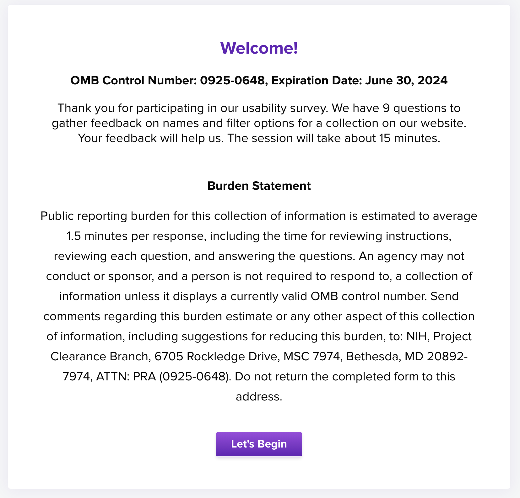
For each usability test, participants will see an introduction screen with instructions, OMB Fast Track number, expiration date, and burden statement, along with a “Let’s Begin” button to start.
Figure 1. Introduction Screen

Up to 10 questions would be asked in each usability test.
Content Feedback Usability Test
What would you read (or try) first?
Screenshot from tool

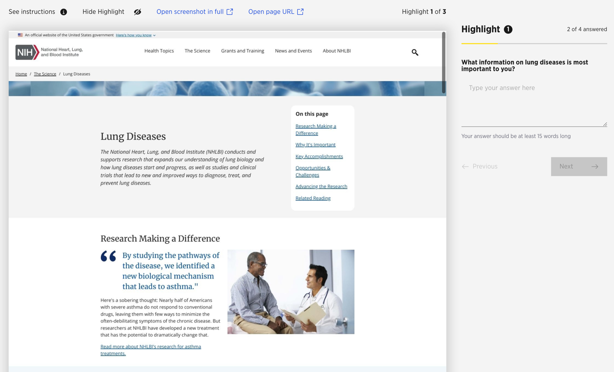
What information on [topic, condition] is most important to you? Why?
Screenshot from tool

Please rate how easy it is to read the content.
Screenshot from tool

PLEASE NOTE: The remaining questions will use the same structure as those above – screenshot on left / question on right for easy participant reference.
How useful would this be for you? 1 – not useful to 5 – very useful
I want to read the next paragraph. 1 – not at all to 5 – very much
Please rate the overall clarity of this content. 1 – unclear to 5 – very clear
What are your reactions to how this page is laid out or organized?
How could we improve this [webpage, menu, content, etc.]?
After reading everything, what questions do you still have?
Design Feedback Usability Test
Please click on the first thing that catches your eye on this page.
Screenshot from tool

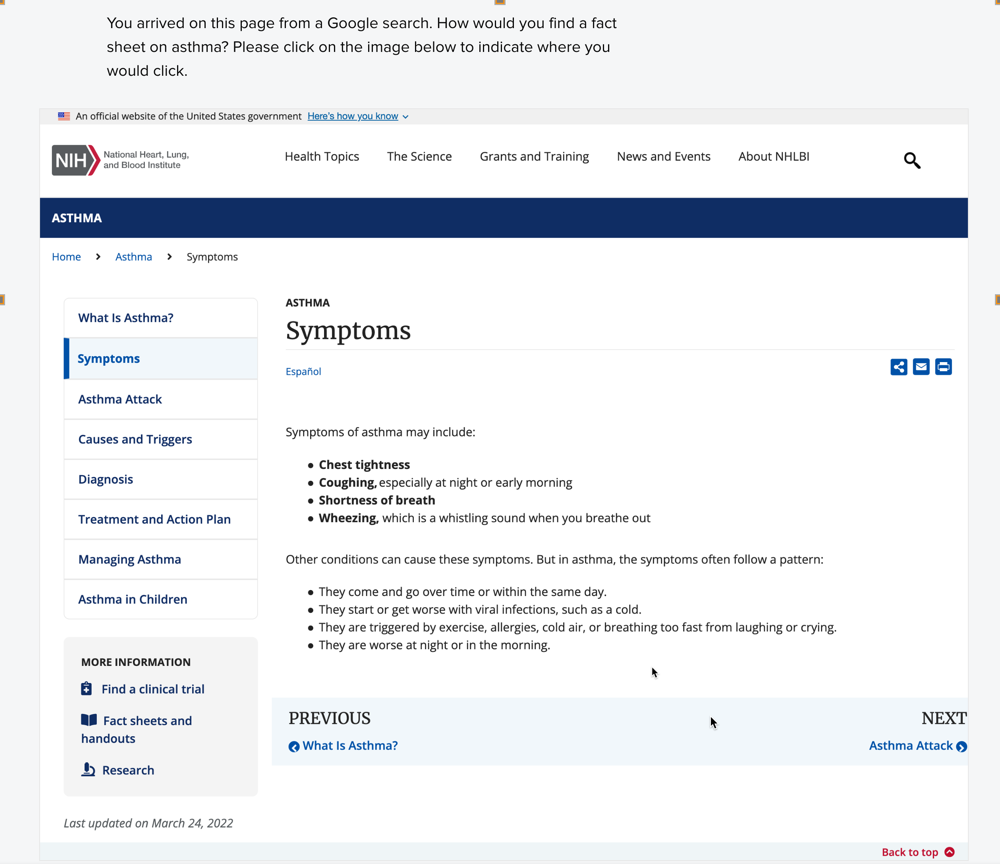
You arrived on this page from a Google search. How would you find […]? [Please click on the image below to indicate where you would click.]
Screenshot from tool

PLEASE NOTE: The remaining questions will use a similar structure to screenshots above and include the relevant screenshots as needed for easy participant reference.
If you wanted to find […], what would you do first? [Please click on the image below to indicate where you would start.]
Why did you choose that [option, label, grouping]?
What did you think about the design of this [component – e.g., webpage, menu, image, headings, etc.]?
What do you like best about this [component]? [Please click on the item/area you like best.]
What are your reactions to how this page is laid out or organized?
How could we improve this [webpage, menu, content, etc.]?
Is there anything you think is missing from this [component]?
Please rate the ‘look and feel’ (i.e., colors, images, fonts, etc.) of this webpage [or design element or content item, etc.].
A/B Comparison Usability Test
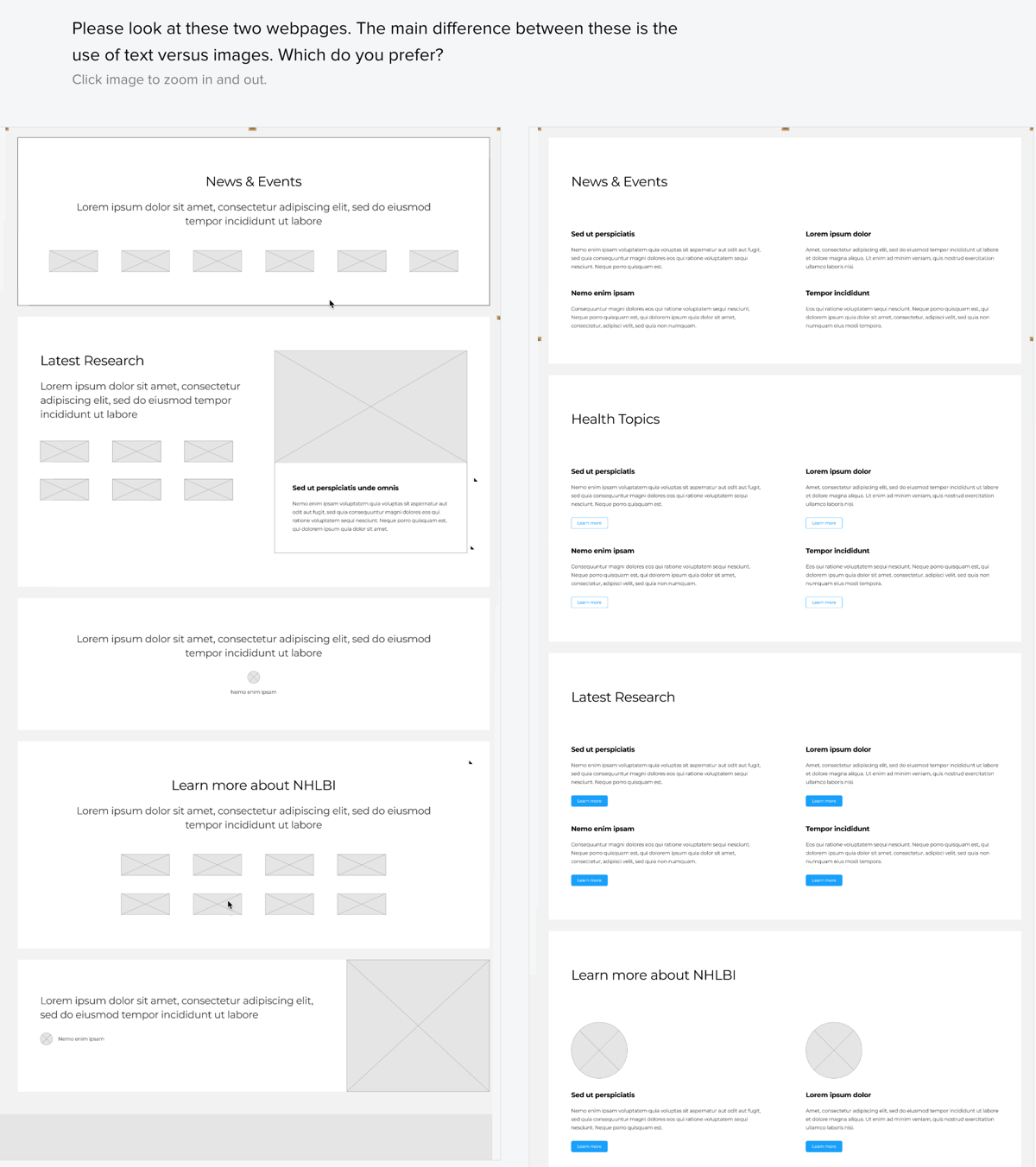
Please take a look at these two [webpages, design elements, content items, etc.]. [The main difference between these two items is …] Which do you prefer?
Screenshot from tool

Why did you select the [webpage, design element, etc.] option that you chose?
Screenshot from tool

If you saw the following list of [items, topics]: […bulleted list of items…] … which label would you choose to describe them? [list possible options and an “Other (please specify):” option]
Screenshot from tool

PLEASE NOTE: The remaining questions will use a similar structure to screenshots above and include the relevant screenshots as needed for easy participant reference.
Why did you choose that [option, label, grouping]?
Please rate the appeal of this webpage [or design element or content item, etc.]. (show Option A)
What could be done to improve your satisfaction with this [webpage, design element, etc.]? (show Option A)
Please rate the appeal of this webpage [or design element or content item, etc.]. (show Option B)
What could be done to improve your satisfaction with this [webpage, design element, etc.]? (show Option B)
What is your overall reaction to the pages you saw today?
Is there anything you think is missing from this [component]?
Page
| File Type | application/vnd.openxmlformats-officedocument.wordprocessingml.document |
| File Modified | 0000-00-00 |
| File Created | 0000-00-00 |
© 2026 OMB.report | Privacy Policy